
How Do You Choose the Best Paint Colors to Hide Imperfections, Especially in Older Homes?
Choosing the best paint colors to hide imperfections, particularly in charming but aged older homes, involves a strategic blend of color theory and practical understanding of light. The secret lies in selecting shades that absorb light rather than reflect it, thereby minimizing the visibility of bumps, dips, and small cracks. Opt for colors with a lower Light Reflectance Value (LRV), often deeper or more muted tones, and always prioritize a matte or flat finish to achieve that seamless, flawless appearance you're after.
Hello there, fellow homeowners! As an interior designer with years of experience transforming spaces, I understand the unique challenges and joys of home renovation. One of the most common dilemmas I encounter, especially when working with older properties or walls that have seen better days, is how to make them look impeccable without undertaking a complete re-plastering job. Those hairline cracks, the subtle undulations from past repairs, or the inherent texture of older plaster can feel like they're screaming for attention, often stealing the spotlight from your carefully curated decor. But what if I told you that the solution often lies not in extensive structural work, but in the intelligent application of interior paint colors to conceal flaws? It's true. The power of paint extends far beyond mere aesthetics; it's a remarkable tool for creating visual harmony and masking imperfections. Our journey today will explore the art and science behind selecting the perfect paint colors to hide imperfections, turning those wall worries into triumphs of design. We'll delve deep into why certain colors and finishes are your allies in this quest, offering practical insights and actionable advice gleaned from countless renovation projects.
Choosing the Right Paint Colors to Conceal Imperfections
When you're faced with walls that aren't perfectly smooth, your paint choice becomes one of the most powerful tools in your arsenal. It's not just about aesthetics; it's about optical illusion and the clever manipulation of light. Competitors often tell you "use matte paint" or "pick dark colors," but they rarely explain why. The "why" is crucial. Imperfections, whether they are minor dings, tiny divots, or slight undulations, become visible because of how light interacts with them. A surface that is perfectly flat reflects light uniformly. Any deviation from that flatness creates a tiny shadow or highlight, making the flaw noticeable. Our goal is to minimize this contrast. Colors with lower reflectivity, often those with richer pigments, absorb more light. This absorption reduces the harshness of shadows and highlights, effectively blurring the lines around imperfections. It allows the eye to glide over the wall without being snagged by every minor flaw. Think of it like a magician's trick: you're drawing attention away from the subtle dips and bumps by creating a soft, diffuse backdrop.
Best Paint Colors for Uneven Surfaces
Let's get into the specifics. For wall paint for uneven surfaces, you'll want to lean into medium to deep tones, and even some carefully selected nuanced neutrals. These colors perform exceptionally well because they possess inherent light-absorbing qualities. Consider sophisticated greys, like a deep charcoal or a warm greige; earthy greens, such as a muted sage or a forest hue; and rich blues, from a serene navy to a soft, dusty denim. These colors don't just look good; they work hard. They create a sense of depth and a uniform visual plane that makes minor imperfections practically disappear.
For example, imagine a living room in an older home, perhaps a charming 1930s bungalow, where decades of life have left a few stories on the walls in the form of small plaster cracks and uneven repairs. A classic choice like a warm, mid-tone greige (a blend of grey and beige) would be transformative. The greige wouldn't simply cover the walls; its complex undertones and moderate light reflectivity would soften the appearance of the surface, making those subtle imperfections fade into the background. The wall becomes a cohesive canvas rather than a series of disparate flaws. Similarly, in a cozy bedroom with slightly textured walls, a deep, muted blue can be incredibly forgiving. Its depth draws the eye inward, creating a cocoon-like atmosphere, while its light-absorbing properties ensure that any minor bumps or scrapes are visually minimized. These are the best paint colors to hide imperfections in older homes, leveraging their inherent visual properties to your advantage.
Another excellent category to consider is the subtle, muddy greens and blues. Think of colors inspired by nature – olive, moss, slate blue, or even a deep teal. These colors are often found in older homes naturally, making them feel authentic while also providing excellent camouflage. Their organic feel lends itself to creating a serene backdrop, where minor textural shifts on the wall feel more like an intentional part of the home's character rather than glaring flaws. This is especially true for spaces like hallways or dining rooms that benefit from a touch of timeless elegance. The beauty of these colors is their versatility; they pair well with a variety of wood tones and decor styles, making them an ideal choice for a seamless renovation.
Camouflaging Flaws with Neutral Tones
While deeper colors are often champions, don't discount the power of sophisticated neutral tones. However, this is where many articles go wrong by just saying "use neutrals." It's not just any neutral. Pure, stark whites, for instance, are highly reflective and can actually magnify imperfections, casting shadows that highlight every tiny flaw. These are the kinds of colors that make flaws stand out. Instead, we want to choose neutrals with warmth or subtle undertones. Think "dirty whites," "off-whites," and "creamy beiges." A warm white with a hint of grey, yellow, or even a barely-there pink can create a soft, inviting backdrop that is incredibly forgiving.
A well-chosen greige, as mentioned earlier, is a fantastic example of a neutral that effectively hides imperfections. Its blend of grey and beige prevents it from being too stark or too warm, striking a perfect balance that works with various lighting conditions. Consider a very pale, almost white, greige for a bright and airy feel without the harsh reflectivity of pure white. These neutral paint colors for a flawless finish work by creating a gentle, uniform surface that doesn't command attention to itself, thus allowing imperfections to recede. The subtle shift in light across a wall painted in a warm off-white, for instance, will be much less dramatic than on a brilliant white wall, effectively blurring any minor textural inconsistencies.
The key here is depth within the neutral. Avoid anything too thin or flat in its pigment. Look for neutrals that have a certain "creaminess" or "muddy" quality, which naturally diffuse light rather than bouncing it back sharply. For instance, a soft ivory with a touch of beige can bring warmth to a space while being far more forgiving than a crisp, bright white. These sophisticated neutrals are your allies in creating a smooth, serene backdrop that elevates your home's aesthetic without highlighting its little quirks. They are particularly effective in rooms where you want a sense of spaciousness and light, but still need the practical benefit of imperfection-masking paint. The subtle complexity of these hues is what makes them so powerful; they don't just sit on the surface, they subtly shift and adapt with the changing light throughout the day, ensuring that wall flaws remain understated.
Application Techniques for a Seamless Finish
Choosing the right color is half the battle; the other half is in the execution. Even the most perfectly selected hue won't perform its magic if applied poorly. As an interior designer, I've seen countless DIY projects where enthusiasm outpaced technique, leading to results that, unfortunately, highlighted rather than hid wall imperfections. Professional results hinge on meticulous preparation and deliberate application. This means understanding your tools, your paint, and the unique characteristics of your wall surface. We'll dive into strategies that ensure your chosen paint colors work their hardest to deliver a truly flawless finish.
Tips for Painting Textured Walls
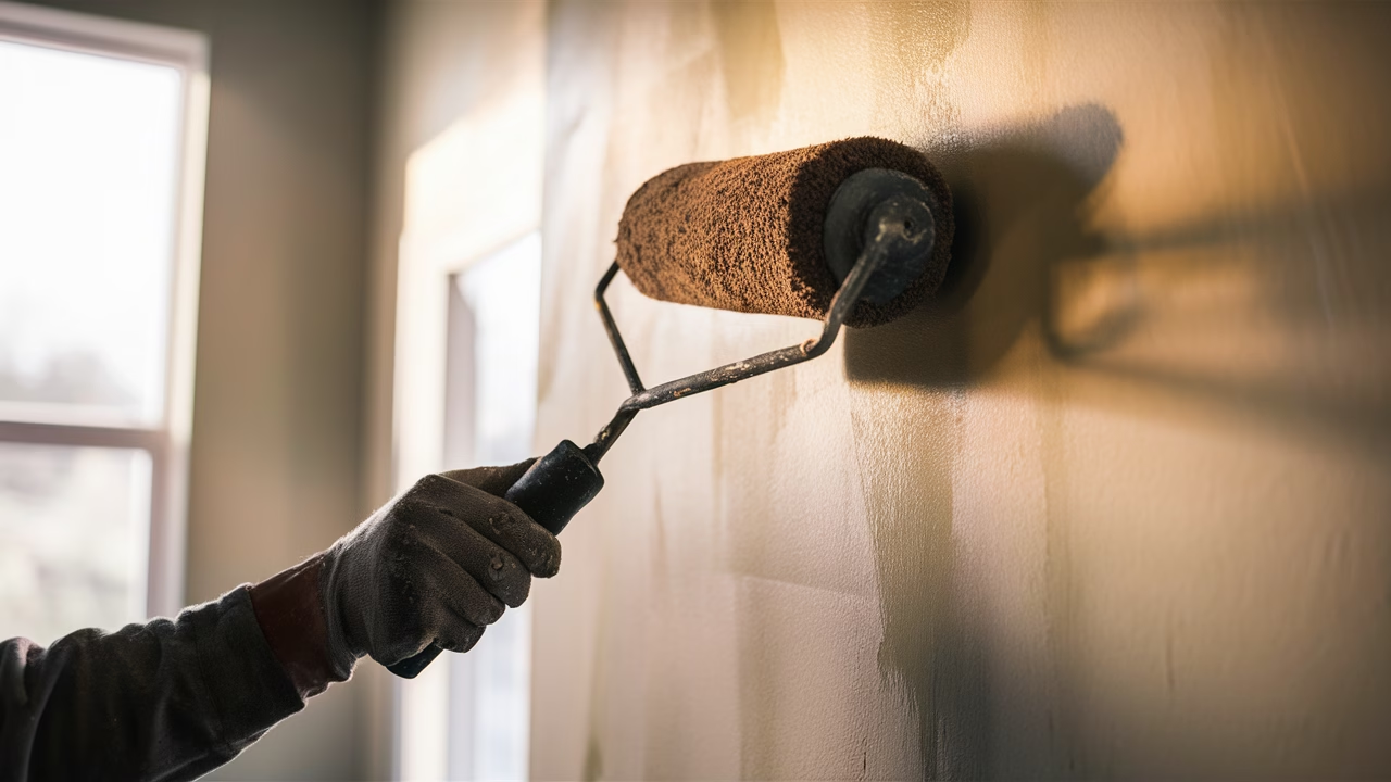
How to choose paint for textured walls is a question I get often, and it's not just about the color, but also the physical properties of the paint itself and the tools you use. Textured walls, common in many older homes or in specific design styles, present their own set of challenges. The texture itself can create shadows and highlights, which can either be accentuated or diminished depending on your approach.
First, consider the paint formula. For textured surfaces, you often benefit from a thicker, higher-build paint. Many manufacturers offer paints specifically designed for textured walls or those with "primer + paint" formulas. These thicker paints can fill in minor inconsistencies more effectively than standard, thinner paints. They provide better coverage with fewer coats, which is a major bonus for `easy wall paint options for DIY projects`.
Next, your tools are paramount. Forget your standard short-nap roller. For textured walls, you absolutely need a roller with a deeper nap, typically 3/4 inch to 1 inch. This longer nap allows the roller to push paint into the crevices and valleys of the texture, ensuring comprehensive and even coverage. Without it, you'll end up with "holidays" (missed spots) that will only make the texture and any underlying imperfections more obvious. For cutting in around trim and corners, use a high-quality angled brush. Don't skimp on quality here; a good brush holds more paint and provides a cleaner line, which is essential for a professional look.
When applying paint, work in smaller sections than you might on a smooth wall. This allows you to really work the paint into the texture before it starts to dry. Use even, overlapping "W" or "M" strokes to ensure full coverage, then go back over the section with light, vertical strokes to smooth out any roller marks. Avoid pressing too hard, as this can create lines and unevenness. The goal is to gently "lay" the paint onto the surface, allowing the roller nap to do the work of filling the texture. For heavily textured surfaces, two full coats are almost always necessary, allowing ample drying time between each. This ensures both color uniformity and maximum imperfection-hiding power, creating a cohesive backdrop that lets the texture itself add character without drawing attention to flaws.
Hiding Imperfections with Layering Techniques
Layering paint is more than just applying multiple coats; it's a strategic approach to building a robust, visually forgiving finish. This is especially critical when dealing with walls that have minor surface issues that you want to obscure. The competitor articles often miss the nuance here, focusing only on single-layer application. My approach involves understanding how each layer contributes to the final illusion of smoothness.
It starts with a high-quality primer. Think of primer as the foundation for your makeup; it evens out skin tone and creates a smooth canvas. For walls with imperfections, a "high-build" or "filling" primer is a game-changer. These primers are slightly thicker than standard primers and can actually fill in minor scratches, pockmarks, and very shallow indentations. They also create a uniform surface for your topcoat, ensuring that your chosen color adheres evenly and without splotchiness, which can itself highlight flaws. Two thin coats of primer are often more effective than one thick one, allowing for better adhesion and a smoother build-up.
Once primed, your topcoats become crucial. Instead of one thick, heavy coat, aim for two to three thinner, even coats of your chosen paint. Why? Thinner coats dry more uniformly and are less prone to streaking or pooling, which can exacerbate the appearance of imperfections. Allow adequate drying time between each coat. When applying, maintain consistent pressure on your roller. Varying pressure can create visible ridges where the paint is thicker or thinner. Use a technique where you apply the paint in a "W" or "M" pattern, then "back-roll" or smooth out the area with light, vertical passes. This helps distribute the paint evenly and minimizes roller marks, which are essentially minor surface imperfections themselves.
Consider a wall in a child's bedroom, perhaps one that has seen a few enthusiastic art projects or furniture bumps. After minor spackling, instead of just slapping on a single coat of paint, a designer would first apply a tinted primer (tinted to be close to the final paint color). This ensures better coverage and color richness. Then, two light, even coats of a forgiving matte paint are applied, allowing each to fully dry. The cumulative effect of the filling primer and the multiple thin topcoats is a surface that appears significantly smoother and more uniform than if a single, heavy coat had been hastily applied. This meticulous layering is key to creating that truly seamless appearance, where the `top paint colors to minimize wall flaws` can truly shine through.
Finishing Touches for Flawless Walls
The journey to creating flawless-looking walls doesn't end with color and application technique. The final, critical decision lies in the paint finish, or sheen. This choice dramatically impacts how light interacts with your wall surface and, consequently, how visible any imperfections will be. It's a common misconception that durability automatically means high sheen; thankfully, paint technology has advanced to offer more forgiving and robust lower-sheen options. Understanding the optical properties of each finish is paramount to making an informed decision that supports your goal of hiding wall flaws effectively.
Gloss vs. Matte: Which Paint Finish Conceals Flaws Better?
This is perhaps the most important "finishing touch" decision when aiming to conceal wall imperfections. The short answer is unequivocally: matte or flat finishes are your best friends. Here's the in-depth explanation missing from many competitor articles:
Matte/Flat Finish: This finish has virtually no sheen. Its microscopic texture is rough, scattering light in all directions rather than reflecting it directly. Imagine shining a flashlight on a piece of velvet versus a mirror. The velvet diffuses the light, making it soft and even. Similarly, a matte finish diffuses light across the wall surface. This diffusion effect minimizes the appearance of shadows and highlights that minor dings, bumps, and uneven patches naturally create. Because light isn't bouncing directly off the surface in sharp, defined angles, the eye struggles to pick out the subtle variations in the wall's topography. This makes it an ideal choice for rooms where imperfections are a known challenge, creating a soft, velvety backdrop that is incredibly forgiving. The only real downside is that flat paints historically were less durable and harder to clean, but modern advancements mean many matte paints now offer excellent washability.
Eggshell/Satin Finish: These finishes have a slight, soft sheen, similar to the dull luster of an eggshell or silk fabric. They offer a good balance between durability and imperfection-hiding power. While they do reflect more light than a matte finish, the reflection is still relatively diffused compared to glossier options. They are a popular choice for areas that require more washability (like living rooms, bedrooms, or low-traffic hallways) where minor imperfections might be present but are not severe. They can still be quite forgiving, especially with well-chosen colors.
Semi-Gloss/Gloss Finish: These finishes are highly reflective. They bounce light directly and sharply off the surface, acting almost like a mirror. Every single imperfection — every tiny bump, every hairline crack, every uneven brushstroke — is magnified and highlighted by the direct reflection of light. These are definitively among the colors that make flaws stand out, not because of the color itself, but because of the finish's optical properties. While durable and easy to clean, they should be reserved for perfectly smooth surfaces or architectural features you want to emphasize, such as trim, doors, or cabinetry. Never use them on walls with known imperfections if your goal is to conceal them. A wall painted in a high-gloss finish will turn even the most minor flaw into a glaring issue, working against all your efforts to create a flawless look.
Therefore, when considering how to choose paint to hide imperfections, the finish is as crucial as the color itself. Prioritize matte or flat for maximum camouflage, especially in older homes or on particularly challenging walls. For a bit more durability with reasonable forgiveness, eggshell or satin are acceptable compromises, but always proceed with caution and a clear understanding of your wall's condition.
Beyond Color: Preparing Your Walls for Success
While the focus of our discussion is rightly on paint colors to hide imperfections and clever application techniques, it would be a disservice to you, the homeowner, not to emphasize the foundational importance of wall preparation. No amount of perfectly chosen paint or expert technique can entirely compensate for poorly prepped walls. Think of it this way: paint is a skin for your walls, and if the skin underneath is damaged, the new layer will only accentuate those issues. This critical step, often rushed or overlooked, is arguably the most vital ingredient for achieving truly `top paint colors to minimize wall flaws`.
The Unsung Hero: Why Wall Preparation is Non-Negotiable
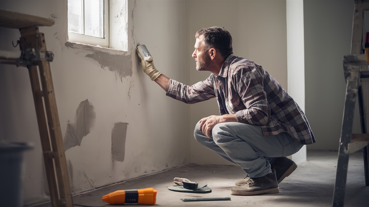
Wall preparation isn't glamorous, but it's the "unsung hero" of any successful painting project, especially when your goal is a flawless finish on imperfect walls. Neglecting this stage is like building a house on sand – it simply won&t hold up, and its flaws will soon become apparent. For easy wall paint options for DIY projects, a robust prep routine makes the actual painting process significantly smoother and the results far more satisfying.
Firstly, **cleaning** is essential. Walls accumulate dust, grime, and oils over time. Painting over these contaminants not only prevents proper paint adhesion, leading to peeling or bubbling, but also creates an uneven surface that will show through your new paint. A simple wash with a mild detergent (like TSP substitute) and water, followed by a clean water rinse, is often all that's needed. Ensure the walls are completely dry before proceeding.
Secondly, **minor repairs** are crucial. Don't assume your clever paint color will hide everything. Small nail holes, picture hook holes, or minor dings should be filled with lightweight spackle. For slightly larger cracks or deeper gouges, a joint compound might be more appropriate. Apply the filler smoothly, slightly overfilling the imperfection. Once dry, sand it down gently until it's flush with the surrounding wall. This process physically removes the imperfection rather than just trying to optically camouflage it, significantly reducing the challenge for your paint. This is particularly important for best paint colors to hide imperfections in older homes, where hairline cracks and plaster damage are more prevalent. Taking the time to patch and smooth these areas reduces the reliance on paint alone to perform miracles.
Finally, **priming** cannot be overstated. As discussed earlier, a high-quality primer, especially one that is "high-build" or "filling," creates a uniform, sealed surface. It blocks stains, promotes adhesion for your topcoat, and, critically, helps to equalize porosity. This means your topcoat will absorb evenly, preventing flashing or dull spots that can highlight subtle wall imperfections. Tinting your primer close to your final paint color further enhances coverage and vibrancy. By investing time and effort in these preparatory steps, you lay the groundwork for your chosen interior paint colors to conceal flaws to perform at their absolute best, resulting in walls that truly appear flawless.
Addressing Common Regional Wall Challenges
As an interior designer, I often see how local climate and housing types present specific challenges for wall maintenance. What works perfectly in a dry, temperate climate might be a recipe for disaster in a humid, coastal region. Understanding these regional nuances is key to selecting not just the right colors, but also the right paint types and preparatory methods that will give you the most durable and visually forgiving finish. This is a critical insight often overlooked by generic paint guides, which fail to provide the context needed for homeowners facing specific environmental issues.
Humidity, Cracks, and High Traffic: Tailoring Your Approach
Different environments throw different curveballs at your walls, and tailoring your approach means your paint colors to hide imperfections will have the best chance of long-term success. It's about being practical and proactive in your renovation choices.
High Humidity Areas (e.g., Coastal, Tropical, or Basements): In regions with persistent high humidity, moisture penetration is a constant threat. This can lead to issues like mildew growth, bubbling paint, or even peeling. For these environments, selecting paints with mildew-resistant additives or using a dedicated moisture-blocking primer is essential. While a matte finish is still ideal for hiding imperfections, ensure the paint is formulated for high-humidity areas. Often, an eggshell or satin finish might be a practical compromise in very damp spaces like bathrooms, as their slight sheen makes them easier to clean mildew off, even if they show minor imperfections more readily than a flat paint. Here, prioritizing mildew resistance and durability might slightly outweigh the absolute best imperfection-hiding qualities, but you can still select forgiving colors.
Areas Prone to Settling and Cracks (e.g., Older Homes, Seismic Zones): Older homes, regardless of climate, are often subject to settling and minor structural shifts that can lead to hairline cracks. In areas prone to seismic activity, these issues can be exacerbated. For such walls, beyond filling cracks diligently, consider using paints formulated with greater flexibility. Some premium paints offer enhanced elasticity, allowing them to stretch slightly with minor wall movements rather than cracking immediately. This isn't a magical cure-all, but it can significantly extend the life of your paint job and prevent minor cracks from reappearing too quickly. Coupling these flexible paints with your chosen best paint colors to hide imperfections in older homes – those deeper, light-absorbing tones – creates a robust and forgiving solution.
High-Traffic Areas (e.g., Hallways, Kids' Rooms, Commercial Spaces): Even if your walls are perfectly smooth, high-traffic areas are magnets for scuffs, bumps, and general wear and tear, which quickly become imperfections. While a matte finish excels at hiding existing flaws, it can sometimes be less durable against repeated rubbing or washing in very high-traffic zones. In these instances, an eggshell or satin finish might offer the optimal balance. Its slight sheen provides increased scrubbability and durability against daily abuses, while still being relatively forgiving of minor surface inconsistencies. The key is to select a forgiving color within that slightly higher sheen. For example, a mid-tone greige in an eggshell finish in a bustling hallway provides both visual camouflage for any bumps and the practicality needed for frequent cleaning. This tailored approach ensures that your beautiful, "flawless" walls remain so for longer, adapting to the demands of your home's unique environment and usage.
TL;DR: Your Go-To Guide for Flawless Walls
As an interior designer, I often tell homeowners that achieving paint colors to hide imperfections is an art that blends color theory with smart application. The essence lies in choosing hues and finishes that trick the eye by diffusing light rather than reflecting it directly, thereby minimizing shadows and highlights around flaws. Here are the key takeaways for transforming your walls:
- Embrace Deeper, Muted Hues: For best paint colors to hide imperfections in older homes and wall paint for uneven surfaces, opt for medium to deep greys, warm greiges, earthy greens, or rich blues. These colors absorb light, making subtle bumps and cracks less noticeable.
- Strategic Neutrals: Avoid stark, pure whites as they are colors that make flaws stand out. Instead, choose sophisticated "dirty whites," warm off-whites, or complex beiges with subtle undertones to achieve a neutral paint colors for a flawless finish.
- Master the Finish: A matte or flat finish is your ultimate ally, diffusing light and making imperfections recede. Eggshell or satin can be good compromises for durability in moderate-traffic areas, but high-gloss finishes should be strictly avoided for imperfect walls.
- Prioritize Preparation: Thorough cleaning, filling minor holes, and especially using a high-build primer are non-negotiable steps. This crucial groundwork makes the paint job easier and vastly improves the final appearance, helping your top paint colors to minimize wall flaws.
- Smart Application: For how to choose paint for textured walls, use appropriate roller naps (3/4" to 1") and apply multiple thin coats. This layering approach, especially with a good primer, helps to build a truly seamless surface.
- Consider Regional Challenges: Tailor your paint choices (e.g., mildew-resistant for humidity, flexible paints for cracks) to your environment for lasting results.
By following these expert tips, you'll discover that achieving beautifully smooth-looking walls is entirely within reach, creating a sophisticated backdrop for your home without highlighting its minor imperfections.
As your partner in home transformations, I hope these insights empower you to approach your next painting project with confidence and creativity. Remember, every wall has a story, but with the right paint choices and techniques, you can ensure it's a story of seamless beauty.

